Styling Gallery Dept like a pro means understanding how to balance the brand’s signature distressed aesthetic with elevated fashion principles that complement a luxury lifestyle. Gallery Dept pieces—known for their intentionally deconstructed fabrics, hand-painted details, and raw tailoring—require a different approach than conventional styling. Rather than treating them as basic staples, professionals layer these statement pieces with intention, pairing distressed elements against refined pieces to create tension and depth that feels curated rather than accidental.
Consider a Gallery Dept oversized tee with visible seaming and strategic rips paired with tailored trousers and investment jewelry; the contrast elevates both elements, allowing each to breathe within the outfit. The key to pro-level Gallery Dept styling lies in respecting the craftsmanship behind each piece while resisting the temptation to over-accessorize. These garments are inherently bold—they’re meant to be noticed—so your role as a stylist is to amplify their intentionality without drowning them out. This requires restraint, precision, and a clear understanding of color theory, proportion, and the narrative you’re building with your wardrobe.
Table of Contents
- Understanding Gallery Dept’s Design Philosophy and Visual Language
- The Art of Layering with Precision and Purpose
- Accessorizing with Restraint and Intentionality
- Color Coordination and the Neutrality Principle
- Fit and Silhouette Challenges in the Modern Wardrobe
- Styling Gallery Dept for Different Occasions and Contexts
- The Future of Distressed Luxury and Evolving Perspectives
- Conclusion
- Frequently Asked Questions
Understanding Gallery Dept’s Design Philosophy and Visual Language
gallery Dept’s design DNA centers on deconstruction, asymmetry, and the celebration of imperfection as artistic expression. The brand uses unconventional techniques like hand-distressing, irregular hems, mismatched seams, and exposed construction to challenge traditional notions of “finished” clothing. When styling these pieces, you‘re not dressing in casual wear—you’re making a statement about your relationship with fashion as art. This philosophical foundation should inform every styling decision you make.
The brand’s color palette typically gravitates toward neutral and muted tones, with occasional bold accent colors appearing in painted or embroidered details. Blacks, grays, creams, and whites form the foundation, allowing the texture and construction details to become the visual focal points. Unlike brands that rely on logos or bold color-blocking, Gallery Dept communicates luxury through subtlety and craft. When you’re styling a piece, ask yourself whether you’re enhancing the garment’s artistic elements or competing with them. A common misstep among amateur stylists is pairing Gallery Dept with equally loud pieces, creating visual chaos rather than sophisticated balance.
The Art of Layering with Precision and Purpose
Layering is non-negotiable when styling Gallery Dept, but it requires intentionality that casual dressers often overlook. The goal is to create depth and visual interest while allowing each layer to maintain its individual identity. This might mean pairing a deconstructed Gallery Dept overshirt with a clean, minimal base layer and then adding a structured outerwear piece—each component should contribute something distinct to the overall composition. The limitation here is that not every piece works together; oversized Gallery Dept pieces can overwhelm petite frames or create formless silhouettes if layered with additional volume.
Proportion becomes your primary tool in layering. If your Gallery Dept piece is oversized and loose, your base layer should be fitted and your outer layer should be structured. Conversely, if you’re working with a fitted or tapered Gallery Dept garment, you have more flexibility to add volume through layering. Pay attention to where seams and hems fall; Gallery Dept’s irregular construction means you’ll need to ensure each layer’s endpoints create visual breaks rather than visual merging. A warning: oversized Gallery Dept pieces layered with oversized outerwear can read as shapeless, regardless of how intentional the styling is meant to be.
Accessorizing with Restraint and Intentionality
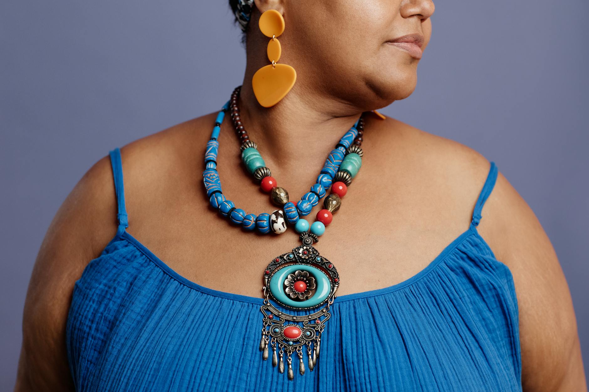
Jewelry selection becomes paramount when styling Gallery Dept, particularly given the brand’s emphasis on craft and construction. Fine jewelry—delicate chains, minimal gold pieces, or vintage luxury watches—complements Gallery Dept’s aesthetic by introducing refined contrast. The distressed textile work of a Gallery Dept jacket becomes even more compelling when set against the polish of a solid gold bracelet or a heritage timepiece. This juxtaposition is what luxury dressing is fundamentally about: the interplay between rough and refined, deconstructed and precise.
Consider a specific example: a Gallery Dept oversized tee with visible seaming and hand-painted detail becomes a completely different outfit when paired with a vintage gold signet ring and a delicate bracelet versus a statement contemporary necklace and multiple chains. The former reads as intentional and sophisticated; the latter reads as confused. The key is understanding that Gallery Dept already makes a visual statement—it doesn’t need a supporting cast of equally loud pieces. Your jewelry should whisper rather than shout, drawing the eye in without competing for attention.
Color Coordination and the Neutrality Principle
Gallery Dept’s color restraint demands that you approach color coordination differently than you might with other contemporary brands. Since most pieces exist within a neutral spectrum, your color story should be either deeply monochromatic or feature one thoughtful accent color that ties to the piece’s painted or embroidered elements. A black Gallery Dept piece works with black, charcoal, white, cream, and gray with equal effectiveness; the tradeoff is that introducing a bright accent color can feel jarring rather than complementary. When you do choose to introduce color, ensure it echoes something already present in the garment rather than standing in isolation.
The comparison here is instructive: traditional styling advice suggests that neutrals need color to feel complete. Gallery Dept styling inverts this principle. The texture, construction detail, and form of the piece provide all the visual interest required. Adding color rarely enhances; it usually dilutes the garment’s impact. If you’re drawn to a Gallery Dept piece in cream or gray, you’re better served building your outfit in complementary neutrals rather than searching for a “pop of color” that doesn’t need to exist.
Fit and Silhouette Challenges in the Modern Wardrobe
Gallery Dept’s intentionally unconventional fit can create challenges when integrated into a broader wardrobe designed around traditional proportions. The brand’s oversized cuts, asymmetrical hems, and deconstructed seaming are deliberate design choices, but they can overwhelm the wearer if not styled with explicit intention. A warning: sizing Gallery Dept is not intuitive. Pieces designed to be oversized may feel unwieldy to the untrained eye; conversely, pieces designed to be fitted might read as constrictive due to irregular construction.
Many stylists make the mistake of sizing up “because it’s deconstructed,” only to create a silhouette that reads as costume rather than intentional fashion. The limitation of Gallery Dept’s fit philosophy is that it doesn’t adapt to all body types and proportions equally. Taller frames can wear oversized pieces with greater visual success; petite stylists often need to carefully consider proportions to avoid looking swallowed by volume. Additionally, Gallery Dept’s hand-construction means some variance exists between pieces of the same style, requiring you to assess fit on an individual basis rather than relying on a universal size chart.
Styling Gallery Dept for Different Occasions and Contexts
The versatility of Gallery Dept depends entirely on which pieces you own and how you approach styling them. A deconstructed overshirt can work in a smart-casual context with tailored trousers and minimal jewelry, or in a more artistic setting with vintage denim and layered chains. The key is intentionality in each context.
A specific example: the same Gallery Dept jacket styled over an evening outfit with a silk slip and heeled boots reads as avant-garde luxury; styled over a white tee and workwear trousers, it reads as creative minimalism. The piece itself doesn’t change, but the context you place it within entirely shifts its narrative. Context also determines whether accessories should be minimal or slightly more intentional. Gallery Dept pieces in professional settings benefit from pairing with quieter, more refined accessories and cleaner lines elsewhere in the outfit; the same piece in a creative or artistic context can accommodate slightly more expressive accessories, provided they still respect the overall restraint principle.
The Future of Distressed Luxury and Evolving Perspectives
The broader conversation around distressed luxury continues to evolve as consumers develop more sophisticated relationships with fashion as art and investment. Gallery Dept sits at the intersection of streetwear accessibility and luxury craftsmanship, a positioning that influences how the brand will likely develop in coming seasons.
Styling these pieces today positions you within an ongoing cultural conversation about what luxury actually means—it’s less about logo visibility and price point, more about craft recognition and individual artistic expression. As the market for deliberately constructed, hand-finished pieces continues to mature, the ability to style these garments thoughtfully becomes increasingly valuable. Gallery Dept represents not a trend but a shift in how luxury fashion communicates value.
Conclusion
Styling Gallery Dept like a pro fundamentally requires a philosophical shift in how you approach dressing. Rather than viewing these pieces as basics that need elevation, treat them as artistic statements that deserve careful curation.
The restraint you exercise in accessorizing, the intentionality in layering, and the precision in color coordination all work together to amplify the inherent craftsmanship and design intentionality that makes Gallery Dept distinctive. Every styling choice should ask: Does this enhance the piece’s artistic vision, or does it dilute it? The pathway to professional-level Gallery Dept styling is built on deep understanding of proportion, the courage to embrace simplicity, and the refinement to know when less is genuinely more. As you develop your relationship with these pieces, you’ll find that the most sophisticated outfits often feel the simplest—a testament to the quality of the foundation you’ve chosen to build upon.
Frequently Asked Questions
Can you wear Gallery Dept pieces to formal or professional settings?
Yes, but with strategic intention. A clean Gallery Dept piece without excessive distressing can work in creative professional contexts when paired with refined tailoring and minimal jewelry. Traditional corporate environments may not align with the brand’s aesthetic, regardless of styling.
How do you care for Gallery Dept pieces given their deconstructed nature?
Hand wash when possible to preserve the integrity of constructed details. The hand-distressing and painting are intentional design elements, not damage, so treat them with the same care you’d give any luxury garment.
Should you mix Gallery Dept with other contemporary brands?
Yes, but choose complementary brands with similar design philosophies—think minimalist, refined pieces that respect negative space and craftsmanship. Avoid pairing with brands that rely on bold branding or visual noise.
What jewelry metals pair best with Gallery Dept?
Gold, silver, and bronze all work depending on the undertones of the specific piece. Generally, cooler metals pair well with grays and whites, while warmer metals complement creams and earth tones.
How do you prevent a Gallery Dept outfit from reading as incomplete or unfinished?
Ensure every other element—fit, proportion, and layering—is intentional and precise. The piece itself is “unfinished” by design; everything surrounding it should feel deliberate and complete.