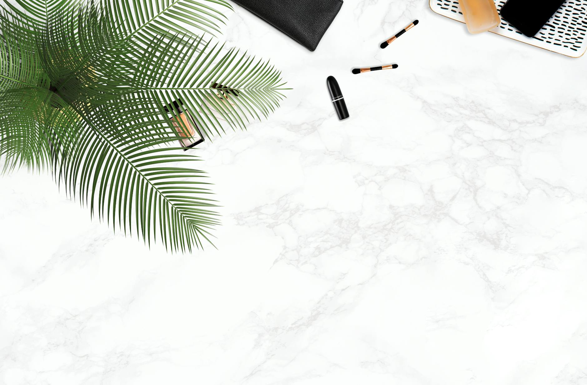
Building drip with neutral colors starts with understanding that restraint creates impact. The foundation is a cohesive palette of black, white, gray, beige, cream, and taupe, anchored by statement jewelry in gold, silver, or platinum that becomes the focal point rather than competing with loud patterns or colors. A well-executed neutral wardrobe with carefully selected precious metal accessories communicates confidence and sophistication that trendy, color-heavy outfits rarely achieve.
Consider the approach taken by style icons like Steve McQueen or Carolyn Bessette-Kennedy: monochromatic outfits in cream or charcoal, elevated by a single substantial piece of jewelry. McQueen’s simple white t-shirt and khakis became iconic partly because his watch””a Rolex Submariner””commanded attention against the understated backdrop. This principle scales from everyday dressing to formal occasions, where neutral clothing creates a canvas that allows precious metals and gemstones to speak without visual competition. This article covers the mechanics of building a neutral palette that flatters your specific undertones, selecting metals that complement rather than clash, layering jewelry effectively against monochromatic outfits, and avoiding the common pitfalls that make neutral dressing look boring instead of intentional.
Table of Contents
- What Makes Neutral Colors the Foundation for Effortless Drip?
- Matching Metal Tones to Your Neutral Wardrobe
- Layering Jewelry Against Monochromatic Outfits
- Building a Core Neutral Wardrobe That Showcases Precious Metals
- Common Mistakes That Make Neutral Outfits Look Boring
- Understanding How Lighting Affects Neutral and Metal Combinations
- The Long-Term Value of Precious Metal Accessories in Neutral Wardrobes
- Conclusion
What Makes Neutral Colors the Foundation for Effortless Drip?
Neutral colors function as visual anchors because they occupy the least aggressive space on the color spectrum. Black absorbs light uniformly, white reflects it, and the spectrum between””grays, tans, and creams””creates minimal chromatic distraction. This optical quietness means anything with reflective properties, particularly precious metals and gemstones, immediately draws the eye. A gold Cuban link chain against a black cashmere sweater creates contrast that the same chain against a patterned shirt cannot achieve. The psychology matters too. Research in color theory consistently shows that neutral palettes communicate competence and reliability, while simultaneously suggesting enough confidence to avoid trend-chasing.
In professional environments particularly, neutral dressing with quality accessories signals status without appearing to try. The person wearing head-to-toe beige with a substantial Cartier bracelet is making a different statement than someone in a logo-covered outfit with the same jewelry. However, neutral does not mean uniform. The distinction between cool neutrals (black, charcoal, slate gray, pure white) and warm neutrals (cream, camel, tan, off-white, chocolate brown) matters enormously for skin tone compatibility. Someone with warm undertones wearing cool grays head-to-toe will look washed out regardless of how expensive their jewelry is. The foundation must flatter before the accessories can elevate.
Matching Metal Tones to Your Neutral Wardrobe
The temperature of your neutrals should generally align with your metal choices, though intentional contrast can work when executed carefully. Cool neutrals pair naturally with silver, white gold, and platinum””metals that share their blue-gray undertones. Warm neutrals complement yellow gold, rose gold, and bronze finishes. Wearing yellow gold against a charcoal and black outfit can appear disconnected, while silver against camel and cream may look clinical. Testing your undertones is straightforward: look at the veins on your inner wrist in natural light.
Blue or purple veins suggest cool undertones, green veins suggest warm, and a mix indicates neutral undertones that can wear either metal family. This simple check prevents the common mistake of purchasing jewelry that works against your natural coloring. Someone with strongly warm undertones will find that even expensive white gold appears slightly off, while yellow gold enhances their complexion. The exception to temperature matching involves deliberate high-contrast styling. A warm-toned person can wear silver successfully against black specifically because black is neutral enough to bridge the gap. The rule breaks down primarily when warm metals meet cool neutrals other than black””silver against navy works, but yellow gold against slate gray creates visual tension that rarely reads as intentional.
Layering Jewelry Against Monochromatic Outfits
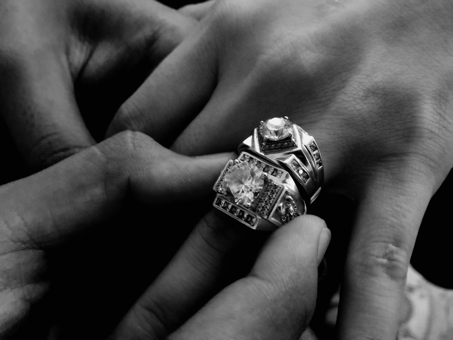
Monochromatic dressing””wearing a single color in varying textures and shades””creates the ideal backdrop for jewelry layering because it eliminates color competition entirely. An outfit in three shades of gray, from pale heather to charcoal, allows multiple silver pieces to exist as a cohesive statement rather than accessories fighting for attention. The jewelry becomes the color, the light, the visual interest that prevents the outfit from reading as bland. Effective layering follows the rule of odd numbers and varied scale. Three necklaces of different lengths (16-inch choker, 20-inch pendant, 24-inch chain) create rhythm that two pieces cannot. The varying distances between each piece give the eye places to rest and move.
Similarly, stacking rings works best in sets of three or five, mixing widths and textures while maintaining a single metal family. A thin band, a signet ring, and a substantial dome ring on adjacent fingers creates intentional variation rather than accidental accumulation. The limitation here involves neckline compatibility. A crewneck sweater supports layered necklaces effectively, but a V-neck creates negative space that shorter chains cannot fill””you end up with jewelry floating above empty fabric. Turtlenecks work only with longer chains or substantial earrings, as anything at the neck competes with the folded fabric. Matching jewelry placement to neckline structure prevents the awkwardness of pieces that look displaced.

Building a Core Neutral Wardrobe That Showcases Precious Metals
A functional neutral wardrobe for jewelry-forward dressing requires approximately fifteen foundational pieces that mix across seasons and formality levels. Start with three base layers: a fitted white tee in substantial cotton, a black silk camisole, and a cream ribbed tank. Add three mid-layers: a gray cashmere crewneck, a camel cardigan, and a black blazer with minimal hardware. Include four bottoms: charcoal trousers, black jeans, cream wide-leg pants, and a taupe midi skirt. Finally, acquire layering pieces: a black topcoat, a tan trench, and outerwear in either slate or camel. The tradeoff between quality and quantity becomes acute in neutral wardrobes because imperfections show.
A cheap black sweater in poor fabric looks obviously cheap, while the same quality level in a patterned print might pass unnoticed. Neutral clothing must earn its keep through fabric weight, construction, and drape””the absence of color reveals everything else. Investing in natural fibers (wool, cashmere, silk, cotton) over synthetics pays dividends because natural materials interact with light differently, providing subtle depth that polyester cannot replicate. Comparing investment approaches: purchasing five high-quality neutral pieces per year over three years yields a fifteen-piece wardrobe costing roughly the same as thirty fast-fashion items, but with a ten-year lifespan versus two. The math favors patience. The person building slowly accumulates pieces that improve with wear””leather softens, cashmere pills less with each wash, quality denim molds to the body””while fast-fashion alternatives degrade immediately.
Common Mistakes That Make Neutral Outfits Look Boring
The primary failure mode in neutral dressing is uniformity of texture. An outfit consisting of a cotton t-shirt, cotton chinos, and canvas sneakers in various beige tones reads as incomplete regardless of jewelry because every surface interacts with light identically. The solution involves mixing textures deliberately: pair a matte wool sweater with leather pants and suede boots, or combine silk with cashmere and denim. Each fabric catches light differently, creating visual interest that color would otherwise provide. Another common mistake involves scale mismatch between body frame and jewelry size. Delicate chains disappear on broader frames, while chunky pieces overwhelm smaller builds. A general guideline: your most substantial everyday piece should be proportional to your bone structure at the wrist.
If your wrist bone is prominent and angular, architectural jewelry with geometric shapes complements naturally. If your bone structure is finer and rounded, curved organic shapes create harmony. Ignoring this proportion creates discord that even expensive pieces cannot overcome. The warning here concerns trend-chasing within neutral palettes. Neutral colors may seem timeless, but silhouettes change. The oversized tan coat that looked current in 2019 appeared dated by 2023. Neutral wardrobes built around extreme silhouettes age as quickly as colorful ones””the absence of color does not confer immunity to fashion cycles. Buying classic proportions, even if less exciting, ensures longevity.
Understanding How Lighting Affects Neutral and Metal Combinations
Indoor lighting dramatically alters how neutrals and metals appear together. Warm incandescent bulbs shift cool neutrals toward brown and make yellow gold appear more orange, while cool LED lighting makes warm neutrals look muddy and silver appear harsh. The outfit that looked balanced in your bathroom mirror under warm lighting may appear disjointed under the cool fluorescent lights of an office.
Testing combinations under multiple light sources before important occasions prevents surprises. The practical approach: assess outfits near a window for natural light, under your home’s artificial lighting, and ideally under the lighting type you will encounter. A cream blouse and gold jewelry combination that looks harmonious in morning light may appear jaundiced under the blue-tinted LEDs common in modern retail and corporate spaces.
The Long-Term Value of Precious Metal Accessories in Neutral Wardrobes
Precious metals represent an unusual intersection of fashion and finance. Gold, silver, and platinum maintain intrinsic value that costume jewelry cannot offer, meaning quality pieces function as both accessories and portable assets. A solid gold chain purchased today will be worth at minimum its melt value decades from now, while the clothing it accompanies will have long since worn out. This dynamic makes precious metal accessories the logical investment center of a neutral wardrobe””the pieces that justify the supporting cast of well-chosen neutrals.
The forward-looking perspective suggests building jewelry collections systematically rather than impulsively. A foundational collection might include: one substantial chain in your primary metal, one pair of classic studs, one everyday ring, one bracelet or bangle, and one statement piece reserved for occasions. These five categories, filled thoughtfully over years rather than months, create a complete jewelry wardrobe that rotates with any neutral outfit. Each subsequent purchase then becomes additive rather than corrective””you are expanding possibilities rather than filling gaps.
Conclusion
Building drip with neutral colors is ultimately about strategic restraint: limiting the color palette to create space for precious metals to command attention, matching metal temperatures to neutral undertones, layering with intentional variation in scale and length, and constructing a foundational wardrobe in quality fabrics that justify the jewelry worn against them. The approach rewards patience over impulse, proportion over trend, and texture over color. The practical next step involves auditing your current wardrobe against the neutral framework.
Identify gaps in your base layers, mid-layers, and outerwear, then prioritize filling them with quality pieces that will serve as backdrops for years. Simultaneously, assess your jewelry collection for gaps in the five foundational categories. Building systematically in both areas creates compounding returns””each neutral piece makes your jewelry more versatile, and each jewelry acquisition makes your neutral wardrobe more interesting.